Sunday, 29 December 2013

Inanimate Alice- Episode 4: Hometown

 - The use of saturated colour creates a surreal atmosphere.
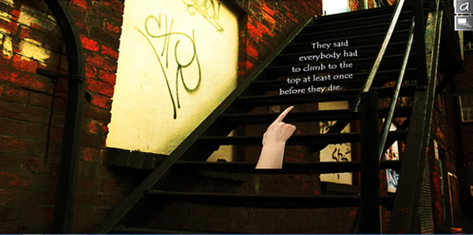
- The letters follow up the path of the stairs to emphasise it's direction.
- The hand enables you to interact with the story to carry on and find out more giving you an active role and interest in the story. 


-Four different things to see at different angles giving a real sense of what has happened in the story. 


-Contrast of white text against a black background is dark and mysterious as you can't see what is happening.


 -The snapshots in polarized style is suited to the girl telling the story. 
-The background of her town from an aerial view against different sections gives you an all rounded insight into her life and story. 
 -This photo looks unedited which could mean this tunnel really is dark and dingy. 
- Her questioning of direction puts the audience on edge.

-She screams, so the background of the graffiti is screaming to emphasise her feelings. As this picture of the screaming person is so realistic it's incredibly powerful and can empathise with how Alice is feeling.

- She makes it out of the tunnel and has a happy ending to her story which means we can see from this snapshot here is bright to giving sense of accomplishment and hope. 


The main feature to this story is the different colours used to create effect and to emphasise certain situations which I am really interested in. As well as this, the images back up the text to give a stronger sense of emotion and makes the story more powerful. 

Friday, 22 November 2013

The Heart and the Bottle by Oliver Jeffers

The little girl is always at the forefront connected to the illustrations and text whereas her grandfathers is in the background but watching over her- keeping his position of authority because he looks after her, but at the same time the girl is the main focus.

The connections between the grandfather and the girl are positive as it gives that family feel, however when we connect the girl sitting in front of an empty chair in a dark room, this signifies loneliness and something missing- her grandfather. This is a negative connection and incredibly emotional for the audience.
The girl is almost always facing to the right, indicating her as the main character. Her grandfather occasionally faces to the right; twice out of five times that he features in the picture book. The other times he’s facing left.
During particular scenes where the girl is at the beach or at any point when an action is particularly notable, the whole page is full of colour. Nevertheless when small and multiple images are used to express time going by, there is lots of white space meaning emptiness. As this is a key theme in the picture book, white space is used quite a lot to portray loneliness and emptiness.
Every page with the girl’s grandpa presents a whole double spread, across the gutter, scene until the point her grandfather dies. It then separates the story through to one page but there isn’t much use of obvious bleeding.
One of the pages for example, we see the empty chair and the girl sat in front of it looking. This positions the audience looking in on the situation, possibly stood in the doorway, quite close, but not so close that we are involved in the situation which is really interesting.
The colours change in one of the last pages from pastel colours to bright and vibrant, this means a happy ending!
In this book I really like how the drawing was as if the little girl drew it; sketchy. As well as this, the pastel colours are used as well as bright and vibrant as a happy ending. Also, when a whole scene is featured, the use of a double page and then small images to show progression works well in the story.